Is it true that a seamless website flow can significantly boost user engagement and conversion rates?
You've likely experienced the frustration of navigating a cluttered website, where finding information is akin to searching for a needle in a haystack. To avoid subjecting your visitors to this ordeal, you need to prioritize a smooth, intuitive website flow. By simplifying your site navigation, you allow users to find what they need with ease.
Ensuring your pages load swiftly prevents the quick loss of impatient visitors. However, these are just the beginning steps to refining your website's user experience. As we explore further, you'll discover how effectively implemented breadcrumbs and clear calls-to-action can guide your visitors subtly yet powerfully towards the actions you want them to take.
Moreover, in today's digital age, neglecting mobile responsiveness is not an option if you aim to cater to the vast majority of users on the go. Stick around, and we'll unpack the essentials that will transform your website into a beacon of user-friendliness and efficiency.
Key Takeaways
- Prioritize a smooth, intuitive website flow
- Cut down clutter and group related pages under broad categories
- Use clear and jargon-free labels for menu items
- Avoid overwhelming dropdown menus
Simplify Site Navigation
Streamlining your website's navigation can significantly enhance users' ability to find what they're looking for with minimal effort. You've got to ensure that your menu is intuitive and that every link takes them exactly where they expect. Remember, if they can't find it, they can't buy it or learn about it.
Start by cutting down the clutter. You don't need a separate tab for every single page. Group related pages under broad, understandable categories. Use dropdowns sparingly; they can be overwhelming if they're too packed. You're aiming for a clean, straightforward path that guides visitors without confusion.
Consider your language, too. Your labels should be clear and jargon-free. Users shouldn't need a dictionary to navigate your site. If they're puzzled by what 'Synergistic Solutions' means, they'll likely bounce faster than a rubber ball. Stick to simple, descriptive terms that leave no room for guesswork.
Optimize Page Speed
While simplifying site navigation helps visitors find their way, boosting page speed ensures they won't be waiting once they get there. You've got to remember, when it comes to websites, every second counts. A slow-loading page can drive away potential customers faster than you can say “404 error.”
So, what can you do? Start by compressing images and videos on your site. Large files take longer to load, and let's be honest, nobody's got time for that. You should also minimize HTTP requests by combining CSS and JavaScript files where possible. This reduces the back-and-forth between your users' browsers and your server, which can seriously speed things up.
Don't forget to leverage browser caching. This allows visitors' browsers to store parts of your site for future visits, so they won't have to reload the entire page every single time. It's like giving them a shortcut back to your site, and they'll love you for it.
Lastly, keep an eye on your hosting solution. Even the most optimized site won't load quickly if your server is sluggish. Invest in a reliable host with fast server response times to give your users the speedy experience they deserve. Remember, swift page loads are key to keeping visitors engaged and on your site longer.
Utilize Breadcrumbs Effectively
To enhance site navigation, incorporate breadcrumbs as they guide visitors through your website with clear, hierarchical pathways. Imagine you're diving into a multi-level category on an e-commerce site; without breadcrumbs, you might lose track of your position. Breadcrumbs show the path from your homepage to the current page, acting like a trail of bread crumbs left by Hansel and Gretel in the classic fairy tale.
Ensure your breadcrumbs are visually distinct and placed consistently on every page. This helps users understand they can rely on this navigation aid no matter where they're on your site. Keep the design simple and the text concise, so it's easy to read and doesn't compete with the main content for attention. Breadcrumbs should be clickable links, allowing users to return to previous pages effortlessly.
Don't let breadcrumbs replace your primary navigation; they're a supplementary tool. Their purpose is to enhance user experience by providing an additional layer of orientation. Use them wisely to avoid clutter—display breadcrumbs on pages where they add value, typically on content-rich websites with multiple levels of hierarchy.
Implement Clear Call-to-Actions
Ensure your website's effectiveness by implementing clear, actionable call-to-actions (CTAs) that guide visitors towards desired actions. Your CTAs are the signposts that tell users what to do next, preventing confusion and drop-offs. They're your tool for nudging visitors along a path you've designed, whether it's making a purchase, signing up for a newsletter, or downloading a guide.
To make your CTAs pop, here's what you need to focus on:
- Visibility: Place your CTAs in easy-to-find spots where they naturally draw the eye.
- Clarity: Use simple, commanding language that leaves no doubt about what'll happen when a button is clicked.
- Design: Make your buttons or links stand out with contrasting colors or bold fonts without being too jarring.
- Urgency: Words like 'now' or 'today' can create a sense of urgency that motivates immediate action.
- Relevance: Tailor your CTAs to match the content on the page, ensuring they're relevant to your visitors' interests or needs.
Design for Mobile Responsiveness
As the majority of internet users now access websites from mobile devices, it's crucial to design your site with mobile responsiveness in mind. Creating a site that adjusts smoothly to various screen sizes ensures that users have a seamless experience, whether they're on a phone, tablet, or desktop.
Start by using a flexible, grid-based layout that adapts to the screen's width. This means your content will reorganize itself to fit the device, preventing the need for excessive scrolling or zooming. Make sure your text is legible on small screens—larger font sizes and button targets can make all the difference in usability.
Optimize your images and videos to load quickly and display correctly on mobile devices. High-resolution media can slow down your site, frustrating users and possibly driving them away. Also, employ media queries in your CSS to apply different styles depending on the device's capabilities.
Frequently Asked Questions
How Can Integrating Social Proof Into My Website Improve User Flow and Engagement?
Integrating social proof into your website can significantly boost user engagement. It builds trust, as you're showing real feedback and endorsements. When visitors see testimonials, reviews, or trust seals, they're more likely to stay engaged, navigate with confidence, and, ultimately, take action.
It's a persuasive element that aligns with human psychology; we're drawn to what others approve of, making your site more compelling and increasing the likelihood of a positive user experience.
What Role Does Content Hierarchy Play in Enhancing the Overall Website Flow?
You're navigating the bustling digital landscape, and content hierarchy is your compass. It streamlines your journey, leading you through information with ease.
By prioritizing key messages and structuring content logically, you'll enhance your website's flow, making sure visitors don't miss a beat. Think of it as the rhythm of your site—without it, users can get lost in a sea of information.
Can the Use of Multimedia Elements Like Videos or Animations Affect the Flow of My Website, and if So, How?
Yes, integrating multimedia elements like videos or animations can significantly impact your site's flow. They grab attention and can explain complex ideas quickly.
However, you've got to ensure they're optimized so they don't slow down your site. Also, it's crucial to place them strategically to maintain a natural progression for users.
Too many can be distracting, so balance is key to keeping visitors engaged without overwhelming them.
How Does the Color Scheme and Visual Contrast of a Website Influence User Navigation and Flow?
You'll find that a well-chosen color scheme and strong visual contrast can significantly guide your navigation through a site. They create visual landmarks, helping you to distinguish between different sections and prioritize information.
Subtle cues from colors can influence your mood and attention, ensuring you're more engaged and less likely to bounce.
What Are Some Strategies for Conducting User Flow Testing to Identify and Improve Potential Bottlenecks?
To identify and improve bottlenecks, you'll want to start by mapping out your user's journey. Then, conduct tests like A/B testing, heatmaps, and user recordings.
It's crucial to gather feedback directly from your users through surveys or usability tests. Keep an eye on analytics to spot where users drop off and iterate your design based on the data.
Conclusion
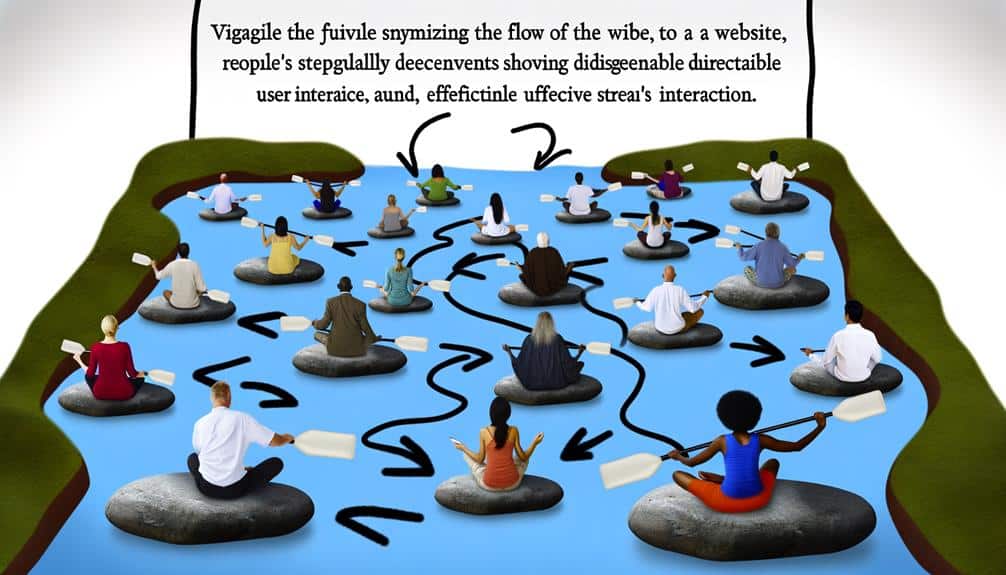
Imagine your website as a river, each page a smooth bend in its course. To keep the current strong and steady, prune excess branches from your navigation, letting visitors glide effortlessly to their destination.
Ensure the waters flow swiftly with optimized page speed, and dot the banks with clear signs—breadcrumbs and calls-to-action—to guide the journey.
Finally, make sure the river is navigable by all devices, providing a seamless voyage on any screen.
Set sail for success with a website that flows without falter.