A picture is worth a thousand words, but only if it's presented correctly on your website. In the realm of web design, you've likely grappled with the challenge of crafting a visual hierarchy that is both intuitive and aesthetically pleasing.
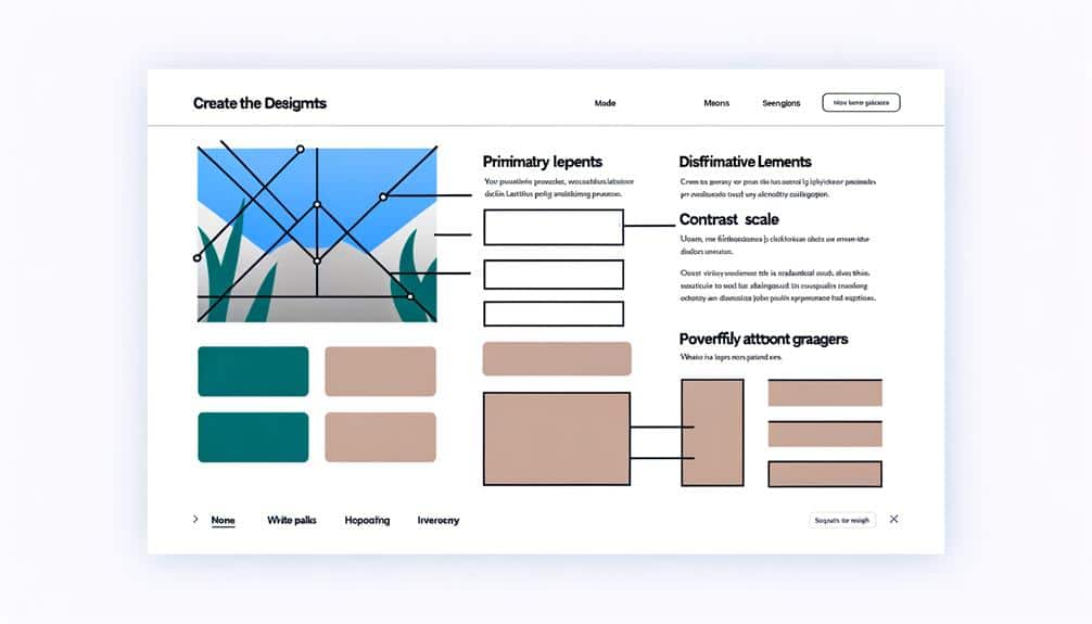
To elevate your site's design, you must harness the subtleties of visual communication. Consider how the strategic use of size not only draws attention but can guide a visitor's journey through your content. Contemplate the power of contrasting colors and how they can create a visual impact that captivates your audience.
Yet, these elements are just the tip of the iceberg. By understanding and applying these foundational tips, you'll set the stage for an engaging user experience that feels as natural as conversation.
So, how do you integrate these principles to ensure your website doesn't just speak to your audience but sings to them? Let's explore the key strategies that can transform your site from mundane to memorable.
Key Takeaways
- Vary the size of elements to draw attention and create a clear hierarchy.
- Utilize contrasting colors to effectively differentiate elements and enhance readability.
- Implement white space effectively to enhance visual comfort and guide user focus.
- Choose typography wisely to reflect tone, prioritize legibility, and create a visual hierarchy.
Utilize Size for Emphasis
In web design, varying the size of elements can significantly draw a user's attention to the most important information. It's a simple yet powerful tool that guides visitors through your site's content with ease. You'll want to make your headlines larger than your body text. But it's not just about making things big; it's about creating a clear hierarchy. Your main headline should be the largest, with subheadings progressively smaller. This isn't just aesthetically pleasing—it's functional.
Think about your call-to-action (CTA) buttons, too. They're your conversion workhorses, so don't be shy to give them sizeable prominence. However, don't go overboard. If everything's large, then nothing stands out. It's all about balance.
Contrasting Colors for Impact
You'll immediately notice the impact of contrasting colors, as they effectively differentiate elements on a webpage and guide the viewer's eye. When you choose colors that sit opposite each other on the color wheel, such as blue and orange or red and green, they pop when placed side by side. This contrast isn't just for aesthetic appeal—it's a strategic design decision that serves a purpose.
Think about your call-to-action buttons; you want them to stand out, right? Use contrasting colors to make them leap off the screen, demanding attention. But beware, overdoing it can lead to a chaotic and confusing interface. Balance is key. You're aiming for emphasis without the eyesore.
Contrasting colors also work wonders for text readability. Dark text on a light background or vice versa ensures that your content is easily scannable and reduces eye strain for your visitors. Remember, it's not just about looking good. You're creating an experience that's intuitive and accessible.
Implementing White Space Effectively
Harnessing the power of white space in web design not only enhances visual comfort but also directs user focus to key content areas. Think of white space as the canvas that allows the elements of your page to breathe. It's not wasted space; it's a powerful tool to create a clean and organized layout that prioritizes content.
To use white space effectively, start by analyzing the flow of your content. Allow ample space around your text and images to guide the eye smoothly from one element to the next. Don't cram information together; instead, give each piece the room it deserves. This separation helps to establish a clear hierarchy, making it easier for users to digest important information.
Choose Typography Wisely
Selecting the right typography is crucial for ensuring your content is both legible and visually appealing. As you delve into the world of fonts and typefaces, remember that the choices you make will significantly impact user experience. Your typography should reinforce the personality of your brand and the message you want to convey.
Here are some key considerations to keep in mind:
- Font Style: Opt for fonts that reflect the tone of your content. A business website might use a clean, sans-serif font, while a creative blog could benefit from something with more personality.
- Contrast: Ensure there's sufficient contrast between your text and its background to facilitate readability.
- Hierarchy: Use different font sizes, weights, and styles to create a clear visual hierarchy, guiding the user's eye through the content.
- Legibility: Above all, your text must be easy to read. Avoid overly decorative fonts that might look interesting but are difficult to decipher, especially for longer texts.
Strategic Layering and Depth
Building on the foundation of thoughtful typography, strategic layering and depth bring additional dimension to your web design, creating a more engaging user experience. You've got to think about how elements stack and interact on the page. Use shadows, overlays, and gradients to suggest a hierarchy that guides the eye naturally from one section to another.
Consider the z-axis as your secret weapon. It's not just about what's on top and what's below; it's about creating a sense of space between elements. This doesn't mean you should go overboard with drop shadows or make your page look like a pop-up book. Instead, use subtle cues. A slight shadow under a button makes it feel clickable, and layering images with text can create a sense of depth that draws the visitor into your content.
Remember to keep it all consistent. If you're using shadows to elevate certain elements, make sure they're uniform across your site. This consistency helps users understand which elements are interactive and which are purely informational.
Frequently Asked Questions
How Does Visual Hierarchy Affect the User Experience for Individuals With Visual Impairments or Color Blindness?
Visual hierarchy greatly impacts your experience if you have visual impairments or color blindness. It helps you navigate a site more easily by clearly indicating which elements are most important. Without it, you might miss vital information or find the site difficult to use.
Designers can use size, contrast, and texture instead of color to ensure you don't miss out due to your visual challenges.
Can Cultural Differences Influence the Effectiveness of Visual Hierarchy in Web Design?
Certainly, cultural nuances can shape your web design's visual hierarchy. Just as spices blend to create unique flavors, cultural elements meld to define aesthetic tastes.
What's intuitive in one culture may be puzzling in another. You must tailor your design to resonate with local preferences and norms. This adaptation ensures that your site's structure speaks the visual language of your audience, enhancing their experience and your site's effectiveness.
How Does the Implementation of Visual Hierarchy Impact SEO and Website Discoverability?
Implementing visual hierarchy boosts your SEO by organizing content for easy scanning, which keeps users engaged longer and reduces bounce rates. Search engines pick up on these signals, potentially ranking your site higher.
Plus, clear headings and subheadings can be SEO gold, helping crawlers understand your content's structure. It's not just about looks; it's smart strategy to make your website more discoverable and user-friendly.
What Are the Best Practices for Maintaining Visual Hierarchy in Responsive Web Design Across Different Devices?
You'll want to ensure your design adapts seamlessly across devices. Start by using flexible grids and scalable images. Prioritize content and features based on screen size, keeping the most critical elements in focus.
Employ breakpoints to adjust layouts for different resolutions. Don't forget to maintain consistent, legible typography and touch-friendly interactive elements. These practices will help you keep a clear visual hierarchy, no matter the device your audience uses.
How Can A/B Testing Be Used to Fine-Tune the Visual Hierarchy of a Web Page?
Oh, look at you, ready to play mad scientist with your web design! By using A/B testing, you'll pit two versions of your page against each other in the ultimate design showdown.
You'll serve different versions to users and track their interactions. Whichever design seduces more clicks, keeps eyes glued longer, or converts more lurkers into buyers—that's your visual hierarchy champion.
It's survival of the fittest, and may the best design win!
Conclusion
So, you've got the basics of visual hierarchy down, right? Think again.
While you're squinting at this text, remember, size does matter.
Those contrasting colors you love? They're not just for show—they're your secret weapon.
White space isn't empty space; it's breathing room for your content.
And fonts? They're not just pretty faces; they tell a story.
Layer like a pro, and watch your designs pop off the screen.
Now, go make your website impossible to ignore.