As you fine-tune your website, consider the placement of your call-to-action (CTA) buttons as crucial as the pieces on a chessboard—each must be strategically positioned to influence the outcome of the game.
Your site's design might be impeccable, but if your CTAs are misplaced, potential conversions could slip through like sand between your fingers. Think about it: you wouldn't hide a store's checkout button in a back corner, so why bury your online CTAs?
In the unfolding narrative of your website's success, the positions of these buttons can make or break the user's journey to action. As you weigh the merits of above-the-fold visibility against the subtlety of in-content suggestions, remember that the balance you strike has the power to transform visitors into customers.
Stick around as we dissect the art of CTA placement, and you just might discover the secret to crafting a more compelling and successful online presence.
Key Takeaways
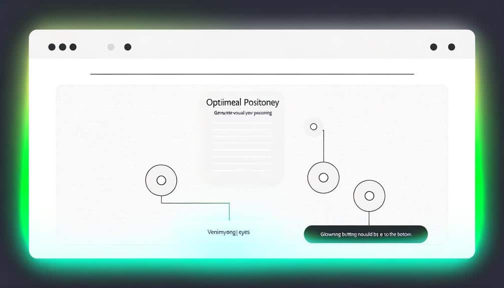
- Prominently display the CTA button above the fold to engage users immediately.
- Integrate CTAs throughout the content to guide visitors along their journey.
- Summarize key points before the CTA to refresh the reader's memory.
- Utilize a persistent sidebar to keep the CTA in sight while visitors scroll.
Above the Fold Essentials
Ensuring your call-to-action (CTA) button is prominently displayed above the fold is crucial for engaging users immediately upon their arrival at your site. You've got mere seconds to grab their attention before they decide to stay or bounce. Think of your above-the-fold content as your storefront; it's what your visitors see first, without having to scroll down.
Your CTA should scream relevance and offer a clear value proposition. Don't just tell visitors to 'Click Here'; show them why they should. Use persuasive language that ties the action to a direct benefit, like 'Get Your Free Guide Now' or 'Start Your Trial Today'. This clarity ensures they know exactly what they're getting from the get-go.
Remember, the position of your CTA can make or break its effectiveness. Research suggests that placing it towards the left, where the eye naturally begins to scan, can increase visibility. Meanwhile, surrounding space, known as 'white space', helps to draw focus to your CTA, making it stand out even more.
Lastly, make sure it's visually striking. Use contrasting colors and a size that's large enough to be noticed, but not so large that it overwhelms your design. Every element should work together to make clicking that button an absolute no-brainer for users.
Strategic In-Content CTAs
While your above-the-fold CTA captures initial attention, integrating strategic in-content CTAs throughout your page can guide visitors along their journey, encouraging further engagement and action. These CTAs, nestled within your content, should feel like natural next steps, not jarring interruptions.
Think of your content as a story, with each CTA acting as a plot point, propelling the reader to the next chapter. You're not just selling a product or service; you're offering solutions to their problems, answers to their questions. That's why your in-content CTAs need to be contextually relevant, offering something that adds value at that particular point in the narrative.
As you weave these CTAs into your content, make sure they're visually distinct without overshadowing the surrounding text. They should stand out because they're appealing, not because they're garish. Subtlety is key. Use language that resonates with the user's intent and keeps them moving smoothly from one section to the next.
Engaging End-of-Post Positions
As you approach the end of your content, strategically placed CTAs can seal the deal, prompting readers to take action after absorbing your message. This is your chance to make a lasting impression and encourage engagement.
Here's how you can optimize end-of-post CTA placement:
- Summarize Key Points: Just before your CTA, offer a quick recap of the article's main benefits. This refreshes the reader's memory and reinforces the message.
- Create Urgency: Use time-sensitive language that compels readers to act now. Phrases like 'Don't miss out' or 'Limited time offer' can create a sense of urgency.
- Offer Value: Make it clear what's in it for them. Whether it's a free trial, a discount, or exclusive content, your CTA should promise a benefit that feels irresistible.
- Stand Out Visually: Your CTA button should pop from the page. Use contrasting colors and ample white space to draw the eye directly to your call to action.
- Test Different Messages: Don't be afraid to A/B test various CTA messages. Finding the right wording can significantly impact click-through rates.
Persistent Sidebar Opportunities
Leverage a persistent sidebar to keep your CTA in sight and top of mind, even as visitors scroll through your content. This constant visibility is a game-changer. It means your call-to-action isn't just a one-time pop-up or a distant memory at the end of a page, but rather a continuous presence that accompanies your reader throughout their journey on your site.
Think of your sidebar as a trusty companion for your visitors. It's there to gently nudge them, reminding them of the action you'd like them to take without being obtrusive. But remember, the key is subtlety. Your sidebar CTA should integrate seamlessly with the design of your page. It shouldn't distract from your content but complement it.
Here's what you need to do: choose a design that stands out yet feels cohesive, and use concise, compelling language. Make sure it's mobile-friendly, as a huge chunk of web traffic is on mobile devices. Most importantly, ensure that it's always within reach. As users dive deeper into your content, your sidebar CTA is their anchor, consistently offering them the opportunity to engage further, subscribe, or take up whatever offer you're presenting.
Footer CTA Considerations
When considering the placement of your CTA, don't overlook the power of the footer where visibility meets usability at the end of their browsing journey. The footer is your last chance to engage users as they're about to leave your page, so make it count. It's not just a place to stick copyright information or a sitemap. Instead, it's an ideal spot for a compelling call-to-action.
Think about the footer CTA as your final pitch. Here's how to make sure it grabs attention:
- Make it Stand Out: Your footer CTA should be distinctive from the rest of the footer content. Use contrasting colors or a bold design to draw the eye.
- Keep It Relevant: Tailor your footer CTA to match the content users have just engaged with. It should feel like a natural next step.
- Simplify the Message: Avoid cluttering your footer with multiple messages. One clear CTA is more effective.
- Test for Performance: Regularly A/B test different CTAs to see what resonates best with your audience.
- Ensure Accessibility: Make sure your CTA is easy to find and click, even on mobile devices.
Frequently Asked Questions
How Do Cultural Differences Impact CTA Button Placement on a Global Website?
You've got to consider that different cultures read and interact with websites in unique ways. What works in one country mightn't fly in another.
For example, color meanings can vary dramatically, influencing how noticeable your CTA button is.
Also, the direction in which people read—left to right versus right to left—affects where you should place your button for maximum visibility.
It's all about tailoring your approach to fit diverse cultural norms.
Can the Color Psychology of CTA Buttons Influence Their Placement Effectiveness on a Website?
Imagine a sea of gray, and there, a red button beckons.
Yes, the color of your CTA buttons can absolutely sway their effectiveness. It's not just what you say; it's how you dress it up. Colors evoke emotions and behaviors, so if you splash your site with the right hues, you're more likely to snag those clicks.
Think of color as your silent salesman, guiding visitors where you need them most.
How Do A/B Testing Results for CTA Placement Vary Between Mobile and Desktop Users?
You'll find that A/B testing results for CTA placement often show significant differences between mobile and desktop users. Screen size and user behavior vary, resulting in distinct interaction patterns.
On mobile, you might see better performance with thumb-friendly zones, while desktop users often respond to CTAs that align with traditional reading patterns.
Always tailor your tests to the platform to ensure you're optimizing placement for your audience's actual browsing habits.
What Are the Legal or Accessibility Requirements to Consider When Placing CTAs on a Website?
Imagine you're setting a table, where each piece must be both appealing and within reach for your guests.
Similarly, when you're placing CTAs on your site, you need to meet legal and accessibility standards. These include the Americans with Disabilities Act (ADA) guidelines, ensuring color contrast for readability, and providing alt text for screen readers.
Don't forget to make your CTAs keyboard navigable too, so everyone can RSVP to your digital feast.
How Does User Behavior Data From Heatmaps Influence the Decision to Relocate Existing Ctas?
You'll find that user behavior data from heatmaps is invaluable when deciding to move CTAs. Heatmaps show where users click and linger, so you can pinpoint high-engagement areas. If your CTAs aren't in these hotspots, it's a clear signal to relocate them where they'll get more attention.
Conclusion
You've nailed your CTA placements, from the top fold to the bottom footer. Don't worry if it feels like overkill; it's all about giving visitors plenty of chances to engage.
By seamlessly integrating calls-to-action where they're most natural, you're not pushing; you're providing opportunities.
So go ahead, watch your site's success story unfold as users click through, captivated by the convenience you've crafted every step of their journey.