Just as you're pondering the best spots to place your call-to-action (CTA) buttons, countless other marketers are grappling with the same question.
It's a pivotal decision: place your CTA too obscurely, and you risk losing potential conversions; too aggressively, and you may annoy your audience.
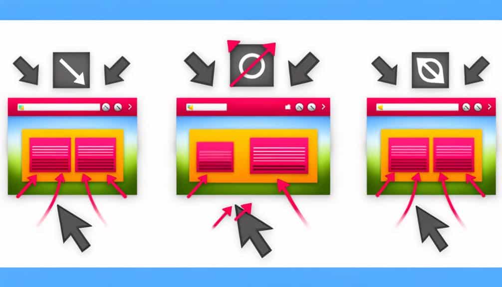
You need to consider the various locations—above the fold, within the sidebar, at the end of content, in a persistent header, or even the often-overlooked footer—each offering unique advantages for engaging your site's visitors.
As you weigh the pros and cons of these positions, you'll find that the effectiveness of a CTA can hinge on subtleties in placement that align with user behavior and expectations.
What's less clear, however, is which of these spots will best capture attention and drive action within the context of your website's design and user flow.
To make an informed decision, you'll need to explore the nuances of each potential location.
Key Takeaways
- Placing the CTA button above the fold is essential to grab users' attention immediately.
- The sidebar is prime real estate for a visible CTA as users scroll, serving as a persistent reminder.
- Placing the CTA at the end of the content prompts an immediate response from engaged readers.
- Implementing a persistent header with a CTA ensures visibility throughout site navigation.
Above the Fold Essentials
Placing your call-to-action (CTA) button above the fold ensures it's one of the first things users see when they land on your page. This prime real estate is crucial because you've got mere seconds to grab a visitor's attention before they decide to stay or bounce. You're competing with countless other distractions, so make your CTA button impossible to miss.
Think of your above-the-fold space as your storefront window. Just as you'd display your best products where passersby can't help but notice them, your CTA button should shout your offer loud and clear. You're aiming for an instant connection—a no-brainer click because the offer is just too good to pass up.
Strategic Sidebar Positions
While securing your CTA button above the fold is vital for initial engagement, strategically positioning it in the sidebar can also capture users' attention as they scroll through your content. The sidebar isn't just a place for ads or secondary information; it's prime real estate for a CTA that remains visible as your audience digs deeper into your page.
You need to be clever about it. Don't just slap a CTA in there and hope for the best. Consider the flow of your content and use the sidebar to complement it. If your content is persuasive and the reader is nodding along, a well-timed sidebar CTA can be the nudge they need to take action.
Moreover, the sidebar CTA serves as a persistent reminder, staying in view even as visitors move down the page. This constant presence keeps your offer at the forefront of their mind, which can be incredibly effective for longer pages where the primary CTA might otherwise be forgotten.
Engaging End of Content
When you reach the end of your content, an engaging call-to-action (CTA) can seal the deal and prompt an immediate response from your readers. It's your final chance to convince them to take action, be it subscribing, purchasing, or further engagement. To make the most of this opportunity, consider these strategic placements:
- Directly Following the Conclusion: Place your CTA right after the last paragraph of your content to capture readers while they're still engaged with your message.
- As Part of the Summary: If you're wrapping up with a summary, integrate your CTA within it as a natural next step for the reader to take.
- Standalone Section: Sometimes, giving your CTA its own space at the end can make it stand out more and draw the reader's attention.
- In the Closing Remarks: Weave your CTA into your goodbye or sign-off to leave a lasting impression and a clear direction for what to do next.
Persistent Header Implementations
Incorporating a persistent header with a call-to-action ensures visibility throughout the user's navigation of your site. This strategy keeps your main action button in sight, no matter how far down the page your visitors scroll. It's a constant reminder of the primary action you want them to take, whether that's to sign up, shop now, or get in touch.
As you design your site, consider placing your call-to-action in the top right corner of the header. It's a natural spot for users to look, as they're conditioned to expect important navigation elements there. Make sure the button stands out with a contrasting color or a distinctive design that draws the eye.
Remember that your header should be responsive, too. On mobile devices, screen real estate is precious, so your call-to-action button must adapt. It should be easily tappable and maintain its prominence without overwhelming the rest of the header content.
Footer Call-to-Action Opportunities
Beyond ensuring your call-to-action remains visible in the header, don't overlook the potential of a strategically placed CTA in your site's footer. While many users expect to find contact information and sitemap links at the bottom of a webpage, a footer CTA can serve as a final nudge for those still undecided after scrolling through your content.
Consider these key opportunities when adding a CTA to your footer:
- Newsletter Sign-Up: Encourage users to stay connected with your brand by offering a simple sign-up form for updates or newsletters.
- Free Trial or Demo: If your site offers a service or software, a footer CTA for a free trial or demo can catch users who are ready to take the next step after reviewing your site.
- Social Media Links: Prompt visitors to join your community by including icons that link to your social media profiles, fostering ongoing engagement.
- Special Offers: Highlight exclusive deals or limited-time offers in the footer to create a sense of urgency and drive conversions before a visitor exits your site.
Frequently Asked Questions
How Does the Color of a Call-To-Action Button Affect Its Performance?
The color of your call-to-action button significantly impacts how well it performs. It's all about visibility and psychology.
Bright, contrasting colors grab attention, while colors like red or green can convey urgency or positivity, potentially increasing clicks.
You've got to test different shades to see what resonates with your audience.
Are There Any Psychological Principles That Can Be Applied to Improve the Effectiveness of Call-To-Action Buttons?
Navigating the human mind's labyrinth, you can indeed leverage psychological principles to boost your call-to-action buttons' impact.
You'll find that incorporating principles like scarcity, urgency, and the fear of missing out (FOMO) can significantly increase click-through rates.
How Do I A/B Test Different Call-To-Action Button Locations to Find the Most Effective One for My Site?
To A/B test your site's call-to-action (CTA) buttons, you'll first set up two versions of a page, each with the CTA in different spots.
Then, you'll split your traffic between these versions. Track conversion rates for each to see which performs better.
It's key to only change the button location between versions to ensure accurate results.
Afterward, analyze the data to determine the most effective placement for your CTA button.
Can the Shape and Size of Call-To-Action Buttons Significantly Impact User Engagement?
Absolutely, the shape and size of your call-to-action buttons can greatly affect user engagement. You're looking for a balance that grabs attention without overwhelming your users.
A button that's too small may get overlooked, while one that's too large might seem aggressive. Aim for a size that's easily clickable on all devices, with a shape that stands out but still fits your overall design.
It's all about making it as simple as possible for users to take action.
How Do Mobile-Responsive Designs Affect the Placement and Success of Call-To-Action Buttons?
You've hit the nail on the head by focusing on mobile-responsive designs. They're crucial for your call-to-action buttons' success.
On smaller screens, you've got to ensure these buttons are thumb-friendly and easy to spot. Their placement often shifts to spaces where you naturally scroll or tap.
This adaptability doesn't just catch the eye; it boosts engagement by fitting seamlessly into the user's experience, making it a breeze for them to take action.
Conclusion
You've discovered the dynamic domains for your call-to-action buttons:
- Above the fold for fast focus
- Strategic sidebars for secondary sights
- Content conclusions for compelling clicks
- Persistent headers for perpetual presence
- Footer features for final forays
Now, go forth and place those powerful prompts where potential patrons persistently peruse.
Propel them to participate, persuading their passage from passive perusal to proactive participation with perfectly positioned prompts.
Your success starts with strategic setup—seize it!