Studies show that it takes about 50 milliseconds for users to form an opinion about your website that determines whether they'll stay or leave. That's a fraction of a second for you to make an impression, and your site's visual hierarchy plays a pivotal role in this snap judgment.
As you evaluate your current layout, ask yourself: does your design guide visitors' eyes to the most crucial elements effortlessly, or does it leave them lost and frustrated?
Establishing a clear focal point and streamlining navigation are just the starting points in crafting an intuitive experience. Yet, achieving the perfect balance between text and imagery is a delicate art, one that requires testing and real user feedback.
Stick around to uncover the secrets to a visual hierarchy that not only captures attention but also enhances user engagement and retention.
Key Takeaways
- Visual hierarchy plays a crucial role in capturing users' attention and guiding them through a website effortlessly.
- Assessing the effectiveness of the current layout through user navigation, feedback, and website metrics is essential for improvement.
- Establishing a clear focal point using scale, color contrast, and directional cues helps hold users' attention and direct them towards desired actions.
- Streamlining the navigation system, balancing text and imagery, and gathering user feedback through testing and surveys are key to creating an intuitive visual hierarchy.
Assessing Current Layout Effectiveness
To accurately gauge your website's visual hierarchy, you must scrutinize how effortlessly users navigate and comprehend your current layout. Start by observing where their eyes land first. Is it on your main call-to-action? Or do they wander aimlessly before engaging with content? You're aiming for the former, where your design elements guide visitors intuitively from one section to the next.
Consider employing tools like heatmaps or user session recordings to see real interactions with your site. You'll identify patterns, like which areas get the most attention and where potential customers drop off. This data is invaluable; it tells you what's working and what's not without guesswork.
Don't forget to solicit direct feedback. Ask users what they think about your site's navigability. Their insights can pinpoint issues you might've missed and highlight what's resonating with them.
Lastly, check your website analytics. Look for metrics such as bounce rates and time on page. High bounce rates can signal confusion or disinterest, prompting a need for layout adjustments. In contrast, longer times on page typically suggest content that hooks and holds attention—a sign of effective visual hierarchy.
Now, take this knowledge and refine your site until it's not just functional, but compelling.
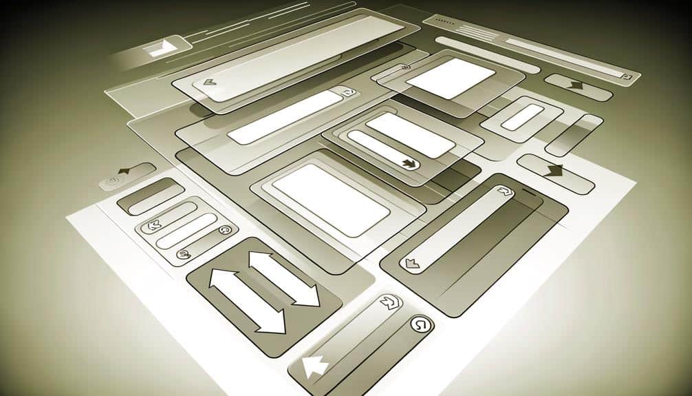
Establishing a Clear Focal Point
Having assessed your layout's effectiveness, it's crucial to establish a clear focal point to anchor your website's visual hierarchy. This focal point is where you want visitors' attention to land first, guiding them through the content effortlessly. Here's how you can make it happen:
- Size Matters: Use scale to your advantage. The larger an element is, the more likely it's going to catch the eye first. Make your main message or most important content the biggest thing on the page.
- Contrast is Key: Differentiate your focal point with color contrast. A bold, contrasting color will stand out against a more muted background, drawing the eye directly to the spot you want.
- Direct with Direction: Utilize directional cues like arrows or images where people are looking towards the focal point. Human eyes naturally follow these paths, leading them to your key content.
Keep in mind that your focal point should align with your website's primary objective. Whether it's a call-to-action button, a special offer, or a key piece of information, make sure it's prominent. It's not just about grabbing attention—it's about holding it and directing your visitors to take the desired action.
Streamlining the Navigation System
A streamlined navigation system ensures your visitors can effortlessly find what they're looking for, enhancing user experience and engagement. Think of your website's navigation as a roadmap. If it's clear and well-structured, users won't get lost; they'll enjoy the journey and reach their destination quickly.
Your main menu should be concise, limiting the number of items to avoid overwhelming your visitors. Prioritize your content by what's most important or frequently accessed. Dropdown menus can be useful, but don't overdo it—too many layers can lead to confusion. Instead, opt for a mega menu if you've got a broad range of categories, allowing users to see everything at a glance.
Remember, your navigation isn't just at the top of the page. Implement 'breadcrumbs' so users can easily trace their path back without multiple clicks. Similarly, a sticky navigation bar that follows as they scroll can be incredibly convenient.
Lastly, ensure your search function is prominent and powerful. Sometimes visitors know exactly what they want, and a search bar is the quickest route there.
Balancing Text and Imagery
Striking the right balance between text and imagery is crucial for creating an engaging and accessible website. Your visitors are looking for a visual experience that guides them through your content without overwhelming them. Here's how you can hit that sweet spot:
- Complement, Don't Compete: Use images that enhance your message rather than distract from it. If your text is the star, let the imagery play a supporting role, providing context and emotion.
- Hierarchy of Attention: Decide what you want visitors to notice first. If it's the text, keep your images subtle. If it's the imagery, use bold visuals with concise captions to keep users intrigued.
- Consistency Is Key: Maintain a consistent style throughout your pages. This doesn't mean all your images should look the same, but they should feel cohesive and aligned with your brand to avoid a disjointed experience.
Testing and Gathering User Feedback
Once you've balanced text and imagery to create a cohesive design, it's essential to test your website and seek user feedback to ensure your visual hierarchy meets your audience's needs. Don't just guess whether your design is effective; confirm it with real user interactions.
Start by conducting usability tests where participants complete tasks while you observe their behavior. This will highlight areas where users struggle and where the visual hierarchy may be falling short.
You can also use heatmaps to see where visitors are clicking and how far they're scrolling. This data gives you insight into what's catching attention and what's being overlooked.
Don't forget to gather qualitative feedback as well. Surveys and feedback forms can provide invaluable insights into what users think about your site's layout and design.
Frequently Asked Questions
How Does Color Psychology Impact the Visual Hierarchy of a Website?
Color psychology significantly influences your website's design by affecting user emotions and behaviors. You'll find that certain colors grab attention, dictate importance, and guide visitors through content effectively.
For instance, red can signal urgency or importance, making it ideal for call-to-action buttons. On the other hand, blue instills trust and calmness, often used for background or less pressing information.
Can the Use of Animations Enhance or Hinder the Intuitiveness of a Website's Visual Hierarchy?
You can enhance your website's intuitiveness with animations if they're used sparingly. They should guide users' focus without overwhelming them.
However, overusing animations can clutter your site and confuse visitors. It's about finding the right balance.
Animations can point out important features or lead the eye through content seamlessly, but they shouldn't distract or slow down the user experience. Use them wisely to keep your site's navigation smooth and intuitive.
How Does the Choice of Typography Influence a User's Ability to Navigate and Comprehend a Website's Content Hierarchy?
Your choice of typography greatly affects how easily you can navigate and understand content on a website. Fonts, size, and spacing guide your eyes to the most important information, creating a clear path for you to follow. If it's consistent and readable, you'll find it easier to distinguish different levels of information, leading to a better user experience.
However, poor typography choices can make a site confusing and difficult to use.
What Role Do Cultural Differences Play in the Perception of Visual Hierarchy in Web Design?
Cultural differences greatly impact how you perceive visual hierarchy. What's intuitive in one culture might be confusing in another due to varying symbols, color meanings, and layout preferences.
You've got to consider these aspects when designing for a global audience. They can dictate where eyes naturally go first on a webpage and influence how effectively you communicate your site's structure and content priorities to diverse users.
How Does Responsive Design Affect Visual Hierarchy on Different Devices and Screen Sizes?
Responsive design reshapes your content like a chameleon changing colors. It ensures your site's structure makes sense on any device, from a giant desktop to a tiny phone.
You'll see menus morph and images adjust, maintaining a clear path for your eyes to follow. It's all about keeping users engaged, no matter the screen size.
Conclusion
Have you nailed it? The true test of your website's visual hierarchy is in its silent performance.
Hold your breath as real users interact, their clicks echoing your design's clarity and intuition. If they pause, second-guess, or backtrack—listen. That's where your site whispers its needs for refinement.
Keep iterating, because in the dance of text, image, and navigation, only the user's seamless journey sings success.
Don't rest yet; the final act of user approval is just around the corner.