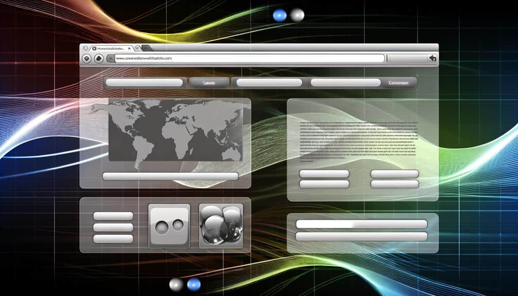
Navigating a well-designed website should be as seamless as flipping through the pages of your favorite magazine, where each turn is intuitive and every article is effortlessly located. You've likely encountered both ends of the spectrum: the frustration of a cluttered, confusing interface versus the satisfaction of a smooth digital experience.
As the digital landscape continuously evolves, so must the strategies behind web navigation to ensure you're not only keeping pace with your competitors but also exceeding user expectations. Consider how prioritizing intuitive layouts, embracing responsive menus, and simplifying navigation labels can elevate the overall experience for your visitors.
Yet, the key to mastering this evolution lies not only in these elements but also in understanding the subtle shifts that can make or break your site's navigability. Stick around to explore how streamlining content hierarchy and effectively utilizing visual cues can transform passive visitors into active, engaged users.
Key Takeaways
- Design an intuitive layout that guides users through the content naturally
- Use responsive menus that adapt seamlessly to different devices
- Craft concise and clear navigation labels that communicate the content of each page
- Organize content in a logical order, prioritize important information, and simplify the path to desired content or actions
Prioritize Intuitive Layouts
When designing your website, it's crucial to prioritize an intuitive layout that naturally guides users through your content. You're aiming for a user-friendly experience where visitors can easily find what they're looking for without feeling overwhelmed or lost. Think of your website as a map; you wouldn't hand someone a cluttered, confusing map and expect them to reach their destination without frustration, would you?
Your main navigation should be simple and straightforward. Place it where users expect it to be; across the top or down the left side of the page. Stick to familiar terms in your menu—words like 'Home,' 'About,' 'Services,' 'Contact'—so users don't have to guess what they mean. You're not just designing; you're communicating.
Don't forget that your layout must adapt to different devices. Your navigation should be as intuitive on a smartphone as it's on a desktop. Dropdown menus or a hamburger icon can save space on smaller screens, but make sure they're easy to use with a touch interface.
Lastly, remember that a clean design aids navigation. Avoid clutter. You're creating pathways, not obstacles. Make sure every element on your page serves a purpose and contributes to a seamless journey for your visitors.
Embrace Responsive Menus
You'll enhance user experience significantly by embracing responsive menus that adapt seamlessly to any device your visitors use. Imagine your audience navigating through your site with ease, whether they're on a desktop, tablet, or smartphone. That's the magic of responsive menus. They're not just adjustable; they're designed to provide an optimal experience on any screen size.
Responsive menus condense lengthy navigation bars into simple, touch-friendly icons and drop-downs on smaller screens. This prevents the frustration of zooming in and out or accidentally clicking the wrong link. You're offering a clear path to what they're looking for, no matter how they access your site.
Don't just settle for a one-size-fits-all approach. Test your menu's adaptability across different devices. Ensure that the transition from a full menu on desktops to a hamburger icon on mobile devices is smooth. This icon expands to reveal a menu that's easy to scroll through, maintaining usability without compromising design.
Simplify Navigation Labels
Building on the idea of responsive menus, simplifying your navigation labels further enhances accessibility and guides visitors effortlessly through your website. When you're crafting labels, think clarity over cleverness. Your goal is to let users know exactly what they'll find when they click. Ambiguity is your enemy here; it leads to frustration and a higher bounce rate when users can't quickly find what they're looking for.
Ensure that your labels are concise. Long, descriptive phrases may seem helpful, but they often clutter your navigation and overwhelm your visitors. Stick to one or two words that directly communicate the content of the page.
Remember to prioritize consistency across your site. This means using terminology that your audience is familiar with and maintaining that language throughout your pages. If you start with 'Contact' as a label, don't switch to 'Get in Touch' halfway through the site. This could confuse users and disrupt their browsing flow.
Lastly, avoid jargon and industry-specific terms unless you're certain your audience understands them. When in doubt, opt for simpler words that won't exclude users who may not be as familiar with your field. Your navigation isn't the place to show off your vocabulary; it's where you guide your users as seamlessly as possible.
Streamline Content Hierarchy
To enhance user experience, cut through the clutter by streamlining your website's content hierarchy for intuitive navigation. Think of your website as a map; it should guide users to their destination with the least amount of confusion.
Start by organizing content in a logical order that reflects user needs and behavior. Group similar items together, creating clear categories that make sense to your audience.
Don't bury important information under layers of less relevant content. Instead, prioritize the essentials, placing them front and center where they're easily accessible. Consider using a 'less is more' approach, where you provide a simplified path to the most sought-after content or actions.
Keep in mind that a streamlined hierarchy isn't just about reducing steps. It's about making each step more meaningful and clear. Use breadcrumbs to help users track their journey and make it easy to backtrack when necessary. Employ dropdown menus sparingly, ensuring they don't overwhelm or confuse.
Utilize Visual Cues Effectively
Employing visual cues on your website can significantly aid users in navigating through content with ease and precision. These cues act as subtle guides, steering your audience to the information they're seeking without overwhelming them. You've got to strike the right balance between functionality and aesthetics.
First off, consider icons. They're not just decoration; they serve as intuitive signals that lead to quicker understanding. For instance, a magnifying glass icon universally suggests a search function. You're pairing familiar imagery with actions, making navigation almost instinctive.
Don't forget color contrasts. They aren't there just to look pretty; they highlight important elements like call-to-action buttons or alerts. When you use a bright color against a muted background, you're effectively saying, 'Hey, look here!' It's about making sure that key features pop out at the right moment.
And what about hover effects? These aren't just fancy tricks; they provide immediate feedback. When a menu item changes color as you hover over it, you know it's clickable. It's a direct communication line with your users, confirming their choices even before they click.
Incorporate these visual cues thoughtfully. They'll not only enhance the aesthetic of your site but will also streamline the navigation process, making your website more intuitive and user-friendly.
Frequently Asked Questions
How Do Evolving Web Navigation Practices Impact SEO and Search Engine Rankings?
You mightn't realize it, but changes in web navigation can greatly impact your SEO and search engine rankings. If you streamline your site's navigation, search engines can crawl it more efficiently. This means they'll likely rank your content higher.
Plus, when users find what they're looking for faster, they stay longer, reducing bounce rates. And since user engagement is a ranking factor, this can indirectly boost your position in search results.
Can Enhanced User Experience Through Better Navigation Lead to Measurable Increases in Conversion Rates?
Imagine gripping a map that guides you effortlessly to treasure. That's what seamless navigation does for your website.
Now, if you enhance your site's user experience with intuitive paths, you're likely to see a spike in conversion rates. Yes, better navigation can lead to more people clicking 'buy' or 'subscribe,' because they find what they need faster, and with less frustration.
It's about making their journey as smooth as possible.
What Are Some Common Mistakes Businesses Make When Trying to Improve Their Website Navigation for Mobile Users?
When you try to improve your website's mobile navigation, you might overlook simplicity, leading to cluttered menus. You'll want to avoid hidden navigation elements that can frustrate users.
Also, don't assume desktop strategies work for mobile; the touch interface requires bigger, easily clickable areas. Be wary of excessive dropdowns; they're harder to use on touchscreens.
And remember, if your site isn't responsive, users will struggle regardless of your navigation tweaks.
How Does User Behavior Analytics Influence the Evolution of Web Navigation Practices?
You'll find that user behavior analytics heavily influence web navigation updates. By tracking how you interact with sites, designers can pinpoint where you're getting stuck or leaving. This data helps them streamline navigation, ensuring it's intuitive and hassle-free.
They'll often adjust layouts or simplify menus based on your actions, making your online experience smoother and more enjoyable. It's all about adapting to your needs to keep you engaged and satisfied.
Are There Any Accessibility Concerns That Need to Be Addressed When Implementing New Navigation Strategies?
Yes, you must address accessibility concerns when updating navigation.
Imagine a staircase next to a ramp; both lead to the same place, but the ramp is essential for wheelchair users.
Similarly, your new navigation should be usable for everyone, including those with disabilities.
Ensure screen readers can interpret it, and don't rely solely on color to convey information.
Consider keyboard-only navigation and provide alternative text for images.
It's about inclusivity, not just aesthetics.
Conclusion
You've mastered the art of seamless web navigation. With an intuitive layout, your site feels like second nature. Responsive menus morph effortlessly, catering to every device. Simple labels guide visitors, while a streamlined hierarchy unveils content treasures.
And visual cues? They're the silent whispers leading users to the unknown. But remember, the web's landscape is ever-changing. Stay alert, adapt, and your website won't just be a destination, but an unforgettable journey.