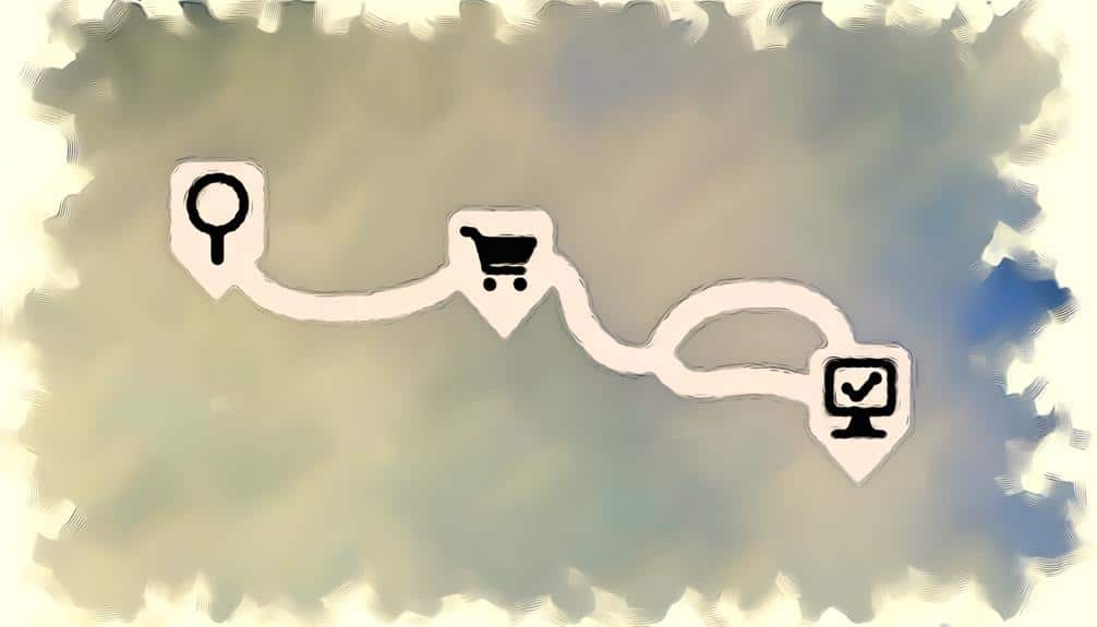
You've certainly crafted the perfect labyrinth if your website visitors need a ball of thread to navigate from homepage to checkout. But let's assume for a moment that your goal isn't to emulate the Minotaur's maze but to streamline the journey your users take.
You'll want to start by decluttering that site structure of yours; simplicity is key to ensuring visitors don't get lost in the digital underbrush. It's crucial, too, to refine those link descriptions to guide users with the subtlety of a seasoned tour guide, rather than leaving them to blindly click in hopes of finding their desired destination.
As you consider enhancing your site's search functionality and weaving in breadcrumb navigation, remember that the ultimate goal is to make their journey not only successful but enjoyable.
And in the realm of mobile responsiveness, if you're not prioritizing it, you're effectively rolling out the unwelcome mat. Stick around, and we'll explore how to transform your site into a beacon of user-friendliness, a place where visitors not only arrive with ease but linger with pleasure.
Key Takeaways
- Simplify site structure and navigation by organizing content into clear categories and sorting products/services into relevant categories.
- Optimize link descriptions for SEO and accessibility by using relevant keywords, keeping descriptions concise and descriptive, and avoiding generic phrases.
- Enhance search functionality for improved user experience by making the search bar visible and intuitive, using a smart search engine with suggestions and typo correction, and implementing filters to refine search results.
- Implement breadcrumb navigation for easy navigation by keeping it simple and standard, making each step clickable and interactive, and placing breadcrumbs near the top of the page.
Simplify Site Structure
Streamlining your site's structure not only enhances navigability but also ensures users can find what they're looking for with minimal effort. By simplifying your site's architecture, you're cutting down on clutter and confusion, which in turn, boosts user satisfaction and retention rates.
Start by organizing your content into clear, logical categories. Your menu should be intuitive; if you're selling products, sort them into categories that make sense. If you're providing services, group them by function or benefit. Remember, you're aiming for a structure that's as straightforward as a well-organized book—think contents page, not a labyrinthine archive.
You've got to make sure your search function is top-notch, too. It should be prominently placed and capable of delivering accurate results. Quick, relevant search responses are a lifeline for visitors who've got something specific in mind.
Don't overlook your website's footer—it's prime real estate for helping visitors navigate your site. Include links to your most important pages, contact information, and a sitemap. This way, if users scroll to the bottom, they won't hit a dead end.
Above all, test your site's usability. Ask friends or colleagues to find specific information and watch how they navigate. Their journey will highlight any bumps in the road, giving you the chance to smooth them out before they trip up your visitors.
Optimize Link Descriptions
Crafting clear and descriptive links is crucial for guiding users seamlessly through your website's content. It's not just about aesthetics; it's about clarity and context. When you optimize link descriptions, you're not only improving accessibility but also boosting your SEO efforts.
Here's how you can make your links more informative:
- Use Relevant Keywords
- Helps with search engine ranking.
- Makes links contextually relevant to the content.
- Keep It Concise
- Aim for brevity while maintaining descriptiveness.
- Avoid long-winded phrases that could distract or confuse users.
- Ensure Descriptiveness
- Communicate the value or outcome of clicking the link.
- Avoid generic phrases like “click here” or “read more.”
Enhance Search Functionality
While optimizing link descriptions aids in navigation, enhancing your site's search functionality can significantly improve the user experience by allowing visitors to quickly locate the information they're seeking. You've got to ensure your search bar isn't only visible but also intuitive. Place it prominently on every page, and make sure it's clearly labeled to catch the eye.
Invest in a smart search engine for your site that offers suggestions and corrects typos. Auto-complete features can guide users effectively by predicting what they might be looking for, even before they finish typing. This kind of predictive search is invaluable; it saves time and minimizes frustration.
Don't forget to include filters to refine search results. Users should be able to sort information by different criteria such as price, popularity, or date. This level of control can make their search journey feel empowered and efficient.
Implement Breadcrumb Navigation
Implement Breadcrumb Navigation
Implementing breadcrumb navigation can often enhance your site's usability by providing a clear path for users to follow back to higher-level pages. It's not just about keeping users from getting lost; it's about helping them understand where they're within the structure of your site. Here's how you can do it effectively:
- Keep it simple and standard:
- Use arrow symbols (>) or slashes (/) to separate levels
- List elements from left to right, starting with the home page and ending with the current page
- Keep the text brief, using page titles or main keywords
- Make it interactive:
- Ensure each step is clickable, leading back to the respective page
- Use hover effects to indicate that breadcrumbs are interactive
- Don't include the current page as a link to avoid confusion
- Integrate it seamlessly:
- Place breadcrumbs near the top of the page but below primary navigation menus
- Style them to match your site's design, but ensure they stand out enough to be noticed
- Consider the mobile experience, ensuring breadcrumbs are responsive and don't clutter the screen
Prioritize Mobile Responsiveness
Ensuring your site is mobile-responsive isn't just a courtesy; it's a necessity in today's smartphone-dominated world. Over half of web traffic now comes from mobile devices, and if you're not catering to this audience, you're likely losing out on potential engagement and revenue.
Think about your site's layout on a smaller screen. Is your content easily readable without zooming in? Do your menus and buttons work with a touch interface? These are the basics of mobile responsiveness. If users have to pinch and zoom to navigate your site, they'll bounce off quicker than a rubber ball.
Google prioritizes mobile-friendly websites in search results, which means your site's mobile responsiveness directly impacts your SEO rankings. This isn't just about technicalities; it's about providing a seamless experience for your users no matter the device they're using.
You've got to dive into the nitty-gritty of responsive design. Use flexible grids and images, and consider the user's journey from the moment they land on your homepage to the point of conversion. Test your site on various devices, and don't forget to check loading times—speed is a part of the experience, too.
Frequently Asked Questions
How Can I Measure the Effectiveness of Changes Made to the User Journey on My Site?
You can measure the effectiveness of changes to your site's user journey by tracking key metrics like bounce rate, conversion rate, and user feedback.
Analyze the data before and after making changes to see if there's an improvement.
Use tools like Google Analytics to dive deeper into user behavior, and don't forget to A/B test different versions to find out what works best for your audience.
Can Incorporating Multimedia Elements, Like Video or Audio, Impact the User Journey, and if So, How?
You might worry that multimedia could distract, but incorporating video or audio can actually enrich your user journey. Engaging content grabs attention and increases the time spent on your site, boosting interaction and retention.
It breaks up text, making information digestible and memorable. Just ensure it's relevant and adds value, or you'll risk overwhelming your users. Used wisely, multimedia becomes a powerful tool to enhance user experience.
How Do User Personas Play a Role in Designing the User Journey, and What Are the Best Practices for Creating Them?
User personas are crucial because they represent your target audience's diverse needs and behaviors. To create them effectively, you'll want to gather real user data through surveys, interviews, and analytics.
It's essential to focus on details that influence user decisions and behaviors. You should also regularly update personas as your audience evolves. This ensures your site's design and content stay relevant and engaging to those you're aiming to attract and retain.
What Are the Key Metrics to Track When Assessing User Engagement and Satisfaction Throughout the User Journey?
You'll want to track metrics like bounce rate, page views, session duration, and conversion rates to gauge user engagement and satisfaction.
Look closely at the exit rates for specific pages and the click-through rates for calls-to-action.
It's essential to monitor feedback through surveys and user comments.
These indicators will reveal how well users are interacting with your content and where you might need to make improvements.
How Can A/B Testing Be Utilized to Improve the User Journey, and What Elements Should Be Tested First?
You're navigating A/B testing like a captain through uncharted waters, aiming to refine the user journey. Start by testing your landing page's headline, call-to-action buttons, and navigation layout.
These elements are your compass—they guide users more effectively when finely tuned. Experiment with variations, analyze the data, and you'll notice a smoother sail toward higher engagement.
It's all about finding what resonates best with your audience.
Conclusion
As you captain your website's ship through the digital ocean, remember that the compass of simplicity, the anchor of clear links, the lighthouse of a robust search, the map of breadcrumb trails, and the sails of mobile responsiveness will guide your users to treasure.
With these tools, you'll chart a course through calm waters, ensuring a memorable voyage for every traveler who steps aboard your virtual vessel.
Set sail and watch your site's user journey flourish.