You might not be aware that the color of your call-to-action button can significantly impact your landing page's click-through rate. As you evaluate the elements of your current landing page, consider how seemingly minor adjustments can lead to substantial improvements in user engagement and conversion rates.
From crafting a headline that resonates with your audience to streamlining navigation paths, each tweak is a strategic move towards optimizing your page's performance. You're likely familiar with the basics of these concepts, but the devil is in the details—and it's those nuances that could unlock the potential you're striving for.
Stick around to uncover the less obvious, yet powerful changes that can transform your landing page from good to exceptional, compelling users not just to click, but to act.
Key Takeaways
- Understand the audience needs and desires to create a headline that speaks directly to them
- Minimize menu options and use descriptive labels for navigation buttons and links to reduce decision fatigue
- Use striking visuals, pleasing color schemes, and easy-to-read fonts for visual appeal
- Design persuasive call-to-actions with action-oriented verbs, visually appealing buttons, and a sense of urgency
Compelling Headline Strategies
Crafting an irresistible headline is crucial, as it's your first—and often only—chance to make an impression on potential customers. Your headline's the hook that grabs attention and entices readers to dive deeper.
So, how do you craft a headline that's impossible to ignore?
Start by understanding your audience's needs and desires. What problems do they face that your product or service solves? Use this insight to create a headline that speaks directly to them. You've got to promise a solution or benefit that aligns with what they're seeking.
Keep it short and sweet. You're aiming for punchy, not prosaic. A headline that's easy to read and digest will have a higher impact. Think about using powerful words that trigger emotional responses or create intrigue.
Test different headlines. Don't just settle on the first one that comes to mind. A/B testing can be your best friend here. Try out several variations and see which one performs best. Remember, the data doesn't lie.
Lastly, always align your headline with the content of your landing page. Misleading headlines might increase clicks initially, but they'll tank your credibility and conversion rates in the long run. Stay true to your offer, and you'll attract the right customers.
Streamlining Page Navigation
After capturing your audience's attention with a compelling headline, ensure they can navigate your landing page with ease to maintain their engagement. A cluttered or confusing navigation can quickly lead to frustration and a high bounce rate. Your aim is to guide visitors seamlessly towards the action you want them to take, whether it's signing up for a newsletter, making a purchase, or downloading a resource.
Here are three key ways to streamline your landing page navigation:
- Minimize Menu Options: Limit the number of menu items to reduce decision fatigue. Stick to essential sections and don't overwhelm your visitors with too many choices.
- Use Descriptive Labels: Clearly label your navigation buttons and links to help users find what they're looking for without guesswork. Avoid vague terms and be specific about the content or action each link leads to.
- Prioritize Content with Visual Cues: Highlight the most important elements using size, color, and contrast. Draw the eye to your call-to-action (CTA) and make sure it stands out from other navigational elements.
Enhancing Visual Appeal
While streamlining navigation is crucial, boosting your landing page's visual appeal can significantly increase user engagement and conversion rates. Remember, first impressions are everything. If your page looks outdated or cluttered, visitors are likely to bounce before they even read your headline.
So, how do you captivate them at first glance?
Start with a striking, high-quality hero image that encapsulates your message or product. It should be relevant and emotionally resonant, making users want to learn more. Then, ensure your color scheme aligns with your brand and is pleasing to the eye. Complementary colors can guide visitors through the page and highlight calls to action (CTAs) without overwhelming them.
Typography matters too. Choose fonts that aren't only on-brand but also easy to read. Large headers grab attention, while body text should be simple to digest. Break up chunks of text with bullet points or icons to keep users scrolling.
Lastly, don't underestimate the power of white space. It isn't wasted space; it's a design element that helps reduce cognitive overload. It allows your content to breathe and directs focus to the most important elements on the page.
With these tweaks, you'll craft a visually appealing landing page that's not just nice to look at but also turns visitors into customers.
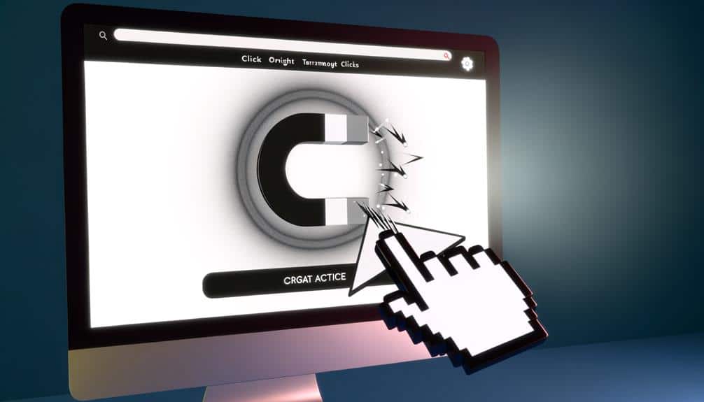
Crafting Persuasive Call-to-Actions
To turn browsers into buyers, your call-to-action (CTA) must be compelling and clear, urging visitors to take the next step with confidence. Don't just slap a “Click Here” button on your page and call it a day. Your CTA should be the culmination of your landing page's persuasive narrative.
Firstly, the language you choose is crucial. Use action-oriented verbs that provoke enthusiasm and excitement. Instead of “Submit,” how about “Get Started,” “Discover,” or “Join Us”? These phrases can make a world of difference by suggesting a beneficial action rather than a mundane task.
Secondly, your CTA must stand out visually. It should catch the eye immediately, but it must also harmonize with the overall design. A contrasting color that complements the palette can do wonders here.
Lastly, create a sense of urgency. You want your visitors to act now, not later. Consider limited-time offers or language that conveys scarcity.
Here's a quick checklist:
- Use dynamic, benefit-focused verbs.
- Design a button that pops but fits in.
- Communicate urgency and exclusivity.
A/B Testing for Continuous Improvement
Harness the power of A/B testing to fine-tune your landing page and elevate conversion rates. A/B testing, or split testing, is where you compare two versions of a page to see which one performs better. You'll change one element at a time—maybe it's the headline, a button color, or the placement of a testimonial. Then, you'll direct half your traffic to each version and measure the results.
Don't just guess what'll work; let the data guide you. Start with a hypothesis based on insights from customer feedback, analytics, or industry best practices. Maybe you think a more prominent CTA will lead to more clicks, or a shorter form will increase submissions. Test it and see.
Frequently Asked Questions
How Can I Make My Landing Page Mobile-Responsive to Ensure Usability on Smartphones and Tablets?
You can make your landing page mobile-responsive by implementing a fluid grid layout, which scales with different screen sizes.
Use responsive images and media queries to adjust content for various devices.
Don't forget to streamline your design for touch navigation and ensure your buttons and links are easily clickable.
Test your page on multiple devices to guarantee a seamless user experience on smartphones and tablets.
What Are the Best Practices for Loading Time Optimization to Reduce Bounce Rates on My Landing Page?
To keep visitors from bouncing, imagine your landing page as a sprinter—every second counts.
You'll want to minimize image sizes, leverage browser caching, and streamline your code.
It's crucial to remove any non-essential widgets and plugins that weigh your page down.
Employ a content delivery network to whisk information to users swiftly.
How Can I Integrate Social Proof Elements Effectively on My Landing Page Without Cluttering the Design?
To integrate social proof on your landing page effectively, start by selecting testimonials that resonate with your target audience. Space them out and combine them with trust symbols, like badges or ratings.
You'll want to keep it clean, so don't overcrowd the page. Instead, use sliders or a dedicated 'what our customers say' section.
What Strategies Can I Employ to Address and Reduce Visitor Anxiety, Thereby Increasing Conversion Rates?
To reduce visitor anxiety and boost conversions, you can start by ensuring your website's security features are visible. Use trust seals and display clear privacy policies.
Make sure your contact information is easy to find and that customer service is readily available. Offer social proof like testimonials and user reviews to build credibility.
Lastly, provide a straightforward return policy to reassure visitors they're making a risk-free decision.
How Can I Ensure My Landing Page Is Accessible to Users With Disabilities, Complying With ADA (Americans With Disabilities Act) or Other Accessibility Standards?
To ensure your landing page is ADA-compliant, you'll need to follow accessibility guidelines.
Start by adding alt text to images, ensuring text contrasts sharply with the background, and using headers to structure content.
Don't forget to create descriptive links and provide transcripts for audio and video.
You can also check your page's accessibility with tools like WAVE or the aXe browser extension.
It's not just about compliance; it's about inclusivity.
Conclusion
Alright, you've got the scoop—now make it pop!
Jazz up that headline, trim the fat off your navigation, and give your visuals some zing.
Don't forget, your call-to-action is your 'ask'—make it irresistible.
And hey, even Edison loved a good experiment, so get your A/B testing groove on.
Stay nimble, keep tweaking, and watch those clicks roll in like it's the roaring '20s and your landing page is the cat's pajamas!