As a digital storefront, your webpage must be as inviting as a freshly-baked pie on a windowsill, beckoning potential visitors with its promise of value. You've likely invested time and effort into your content, but if you're not getting the clicks you anticipated, it might be time for a makeover.
Consider this: are your headlines catchy enough to grab attention? Is your site's visual appeal turning heads, or is it lost in the vast sea of online content? You may need to streamline your navigation to make the user's journey as smooth as possible. And let's not forget the power of a well-placed call-to-action; it can be the difference between a visitor and a conversion.
Stay tuned, as we're about to explore some tried-and-true strategies that can help you transform your page into a click magnet, ensuring that the effort you put into your site truly pays off.
Key Takeaways
- Craft compelling headlines that grab attention and promise something valuable
- Enhance visual appeal with high-quality images and appropriate color choice
- Streamline navigation paths for a smooth user experience
- Create persuasive call-to-action buttons using action-oriented language and visually striking design
Crafting Compelling Headlines
A captivating headline grabs your attention and compels you to read on, acting as the crucial first impression for any page. It's your secret weapon, the hook that snares potential readers in a sea of content. You've got to get it right.
Think of your headline as the flashy billboard on the information highway. It's got to be bold, clear, and intriguing. Start with strong action verbs and vivid language that paints a picture or poses a question. You don't want to give everything away, but you need to ignite curiosity enough that clicking seems irresistible.
Your headline should also promise something valuable. Whether it's a solution, a revelation, or a heartfelt story, ensure it delivers on that promise. False leads will only harm your credibility in the long run. Remember, you're not just aiming to attract clicks; you're building trust with your audience.
Keep it short and sweet. Long-winded headlines lose impact and may not display well on mobile devices. Aim for brevity while maintaining that magnetic pull. If you can shock, surprise, or evoke a strong emotion in a few words, you're on the right track.
Now go ahead, craft a headline that turns heads and draws eyes!
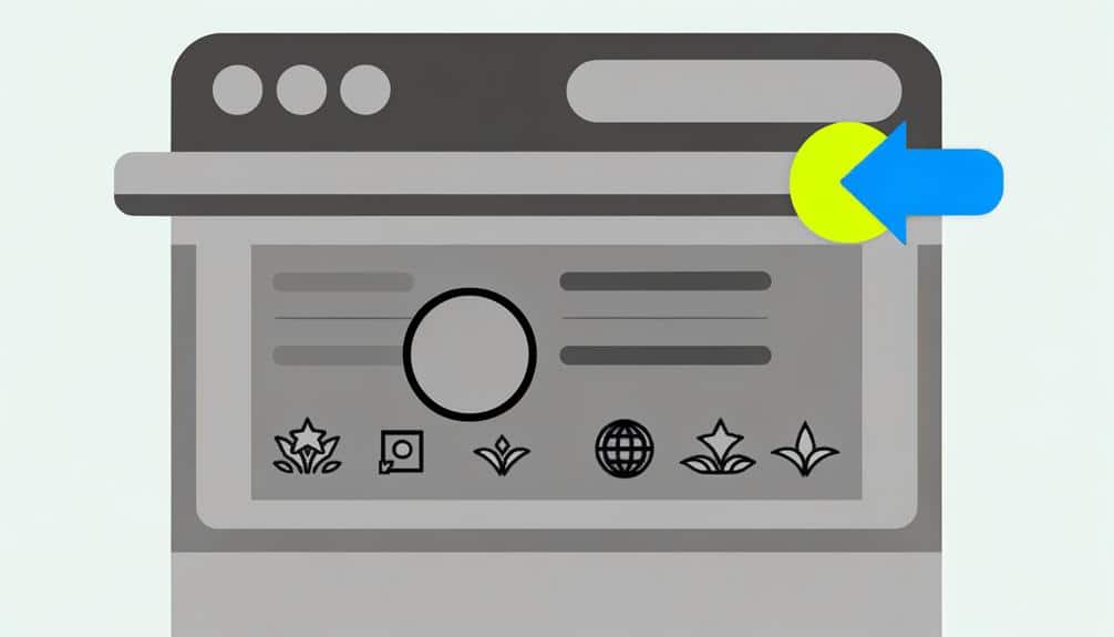
Enhancing Visual Appeal
Now that you've crafted a headline that turns heads, let's ensure the rest of your page keeps eyes glued with an equally stunning visual appeal. It's time to dive into colors, images, and layout—the trifecta of visual allure.
First off, color choice is crucial. It's not just about picking your favorite hues; it's about understanding the psychology behind them. Choose colors that evoke the right emotions and complement your brand. Remember, consistency is key to making your page look professional and trustworthy.
Next, let's talk images. High-quality, relevant images can speak volumes. They break up text, illustrate points, and can trigger an emotional connection with your audience. Make sure they're crisp, clear, and optimized for quick loading times—you don't want to lose visitors to impatience.
Finally, your layout. Clutter is your enemy. Embrace white space; it's not wasted space—it's a powerful design element that helps focus attention on your most important content. Keep your layout clean, intuitive, and easy to navigate. Your goal is to lead visitors effortlessly through your page, compelling them to take action without any visual distractions.
Ace these aspects, and you'll not only catch eyes but captivate them.
Streamlining Navigation Paths
Streamlining your page's navigation paths is crucial for guiding visitors smoothly to their desired destination. When you simplify the journey through your website, you're not just enhancing the user experience; you're also increasing the likelihood of conversions. Think of your navigation as the map that leads users where you want them to go—make it clear, intuitive, and straightforward.
To achieve this, start by analyzing your current navigation structure. Are there too many options? Can you merge similar pages? You don't want to overwhelm users with choices, so trim the fat. Keep the essential links and categorize them logically. Use dropdown menus to organize content under broader headings when necessary, but don't overdo it. Too many layers can frustrate users and lead them away.
Remember, the goal is to get visitors to click through to key pages—those that convert or inform. Place these strategically within your navigation bar, and consider using eye-catching buttons or icons for important actions like 'Buy Now' or 'Sign Up'.
Lastly, ensure your navigation is consistent across all pages. You want users to feel comfortable and in control, not lost in a maze.
Persuasive Call-to-Action Buttons
Crafting compelling call-to-action (CTA) buttons is key to converting site visitors into customers. Your CTA is your final nudge, your digital salesperson's closing line. It needs to be irresistible. Here's how you can ensure your buttons are as persuasive as they can be:
- Use Action-Oriented Language:
Begin with verbs like 'Get,' 'Start,' 'Join,' or 'Learn.'
Provoke enthusiasm with words like 'Now' or 'Today.'
Create a sense of urgency with 'Limited Offer' or 'While Supplies Last.'
- Make It Visually Striking:
Use contrasting colors to make your CTA stand out from the rest of the page.
Size matters; make sure it's big enough to notice, but not overwhelming.
Leave plenty of white space around your CTA to avoid clutter.
- Keep It Simple and Clear:
Limit the text to a clear message – no room for confusion.
Be direct with what visitors will get by clicking, like 'Download My Free eBook.'
Avoid jargon or complex language that might bewilder potential customers.
A/B Testing for Performance
To truly gauge the effectiveness of your CTA buttons, you'll need to embrace A/B testing, a straightforward method that compares two versions to identify which one performs better. Essentially, you're conducting an experiment where half your audience sees version A (the control) and the other half sees version B (the variation).
Start by tweaking one element at a time – it could be the color, size, wording, or placement of your CTA. Ensure you're only changing one variable; otherwise, you won't know what's driving any differences in performance. Once you've set up your test, run it long enough to collect significant data. You're looking for a substantial sample size to ensure your results are statistically valid.
After the test period, analyze the data. Which version had a higher click-through rate? Did version B lead to more conversions than version A? The answers will guide your next steps. If there's a clear winner, implement the changes. If there's no significant difference, don't be disheartened. Use the insights gained to refine your approach and test again.
Frequently Asked Questions
How Can I Ensure My Content Is Accessible to Users With Disabilities When Performing a Page Makeover?
To ensure your content is accessible during a page update, start by implementing alt text for images, using readable fonts, and ensuring proper color contrast.
You should also structure your content with headings for easy navigation, and provide transcripts for audio and video.
Don't forget to test your site with screen readers and seek feedback from users with disabilities to address any issues they might encounter.
What Are the Best Practices for Mobile Responsiveness When Aiming to Increase Clicks?
You might think mobile responsiveness is daunting, but it's key to getting those clicks.
Start by using a fluid grid layout that adjusts to different screens.
Don't forget to optimize images and choose large, legible fonts.
Incorporate touch-friendly buttons and test your site's mobile performance frequently.
By ensuring your page is easily navigable on any device, you'll see an uptick in engagement and, ultimately, more conversions.
Keep it user-friendly and watch your click rates soar.
How Do I Measure the Impact of Page Load Speed on User Engagement and Clicks?
To measure the impact of page load speed on user engagement and clicks, you'll need to use analytics tools like Google Analytics.
Track your bounce rate, average session duration, and conversion rates before and after making speed improvements.
If you see a decrease in bounce rates and an increase in session duration and conversions, it's likely that faster load times are enhancing user engagement and boosting your clicks.
Can Incorporating User-Generated Content Into My Page Design Help Improve Click-Through Rates?
Absolutely, incorporating user-generated content into your page design can create a mosaic of authenticity that resonates with visitors.
It's like seeing a reflection of themselves, which builds trust and can significantly boost your click-through rates.
You're essentially showcasing real stories and testimonials that act as social proof, enticing others to join in.
It's a powerful strategy to engage your audience and keep them clicking for more.
How Do I Maintain Brand Consistency When Making Significant Changes to My Page's Design?
To maintain brand consistency during major design updates, you'll want to keep core elements like logos, color schemes, and fonts consistent.
Ensure any new visuals or interactive features align with your brand's voice and values.
It's also crucial to update all pages simultaneously to avoid a disjointed user experience.
Regularly review your branding guidelines and involve your branding team in the design process to ensure alignment with your overall brand identity.
Conclusion
You've armed your page with magnetic headlines, a feast for the eyes, and a clear path to follow.
Your call-to-action buttons shout 'click me!', and A/B testing sharpens your edge.
Now, watch your digital garden bloom as visitors swarm like bees to honey, eager to taste the nectar of your content.
Keep nurturing, keep testing.
In the online jungle, your page isn't just surviving; it's thriving.
Keep growing, and they'll keep coming.