Studies show that you've got less than 15 seconds to capture a visitor's attention on your landing page before they decide to stay or bounce. As a digital marketer, you understand the stakes are high, and the difference between a conversion and a lost opportunity often hinges on the effectiveness of your landing page.
You're tasked with crafting compelling headlines, utilizing persuasive visuals, and simplifying form fields—all integral elements that can make or break your conversion rates. With an array of proven strategies at your disposal, from enhancing the clarity of your calls-to-action to the intricate nuances of A/B testing, the question isn't just how to implement these techniques, but how to fine-tune them to resonate with your audience.
Stick around to uncover how subtle tweaks to your approach can lead to significant improvements in your conversion metrics, and why mastering these strategies could be the turning point for your online success.
Key Takeaways
- Craft clear and compelling headlines that grab attention and promise something irresistible.
- Utilize persuasive visuals that resonate with your audience's desires and emotions to engage them and guide towards conversion.
- Simplify form fields by asking for only necessary information, using clear labels, and optimizing for mobile devices to prevent abandonment.
- Enhance CTA clarity with action-oriented language, visually contrasting colors, strategic placement, and a sense of urgency to encourage immediate action.
Crafting Compelling Headlines
A captivating headline often determines whether a visitor stays to explore your landing page or bounces back to their search results. It's the hook that grabs attention and teases the value you're offering. Think of it as the gatekeeper to your online realm, where every word counts and the right phrase can make all the difference.
You've got to be clear, concise, and compelling. Start by pinpointing the core benefit of your product or service. What's the biggest draw? Use that to inspire a headline that promises something irresistible, like a solution to a pressing problem or the opportunity to enhance one's life.
Don't be afraid to get creative, but keep it honest and straightforward. Misleading headlines may increase clicks, but they'll also spike your bounce rates and damage trust in your brand. Use strong action verbs and language that resonates with your target audience. Test different headlines to see what works best – A/B testing can be your best friend here.
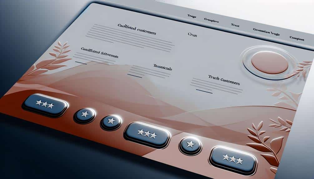
Utilizing Persuasive Visuals
Harness the power of persuasive visuals to instantly engage your audience and guide them towards conversion. A striking image or a well-produced video can convey your message faster and more effectively than text alone. Remember, people process visuals 60,000 times faster than text, so choose images that resonate with your audience's desires and emotions.
Use high-quality, relevant visuals that align with your brand and the product or service you're offering. A mismatch between your visuals and your message can confuse visitors and diminish trust. If you're selling a physical product, include images from multiple angles and videos that show the product in use. For services, use visuals that depict the benefits or the outcome of using your service, like before-and-after transformations or happy customer testimonials.
Don't just decorate; integrate visuals with your call-to-action (CTA). Place them near your CTA to draw the eye and encourage clicks. Ensure that your visuals don't overshadow your CTA, but rather complement and enhance it.
Lastly, test different visuals to see which ones perform the best. A/B testing can reveal which images, videos, or graphics lead to higher conversions. Remember, the right visual can make the difference between a bounce and a conversion. Choose wisely and watch your conversion rates soar.
Simplifying Form Fields
While persuasive visuals capture attention, streamlining your form fields is crucial to keeping it, ensuring visitors don't get overwhelmed and abandon the process. You've drawn them in with striking images and compelling copy, but if your forms are cluttered or confusing, you're basically showing them the exit door. Here's the deal: the easier you make it for them to engage, the more likely they'll follow through.
Keep these pointers in mind:
- Ask for Only What's Necessary: Don't request more information than you need. Each additional field can decrease the likelihood of completion.
- Use Field Labels Effectively: Make sure labels are clear and positioned correctly, so users know exactly what to input.
- Optimize for Mobile: A frustrating mobile experience can kill conversions. Ensure your forms are just as easy to complete on a smartphone as on a desktop.
Enhancing CTA Clarity
Every effective landing page employs a clear and compelling call to action (CTA) that guides users towards the desired outcome. It's the pivotal moment where you encourage a visitor to take the next step, whether it's to buy a product, sign up for a service, or download a resource.
To enhance your CTA's clarity, focus on the language. Use action-oriented verbs and concise phrasing. 'Buy Now,' 'Sign Up Free,' or 'Get Started' are direct and unambiguous—there's no mistaking what you want users to do.
Ensure your CTA stands out visually. Use contrasting colors and consider size and placement on the page. It should be one of the first things visitors see without scrolling. Don't let it get lost amid a sea of text or other design elements; isolation helps it pop.
Remember to create a sense of urgency. Phrases like 'Limited Offer' or 'Act Now' can nudge users to act immediately. However, don't overdo it. Your urgency should be believable, not pushy.
Lastly, test different versions of your CTA. A/B testing can reveal what resonates best with your audience. Pay attention to the details—sometimes, even a minor change in wording or color can make a significant difference in conversion rates.
A/B Testing Essentials
Having established the importance of a clear CTA, it's crucial to understand how A/B testing can help you fine-tune these calls to action for maximum impact. A/B testing, or split testing, allows you to compare two versions of a landing page to see which performs better. You'll make a change to one element, like the CTA button color or wording, and then serve both the original and the modified version to different segments of your audience.
Here's what you need to focus on:
- Hypothesis Formation: Start by forming a hypothesis based on insights or assumptions about your audience. What change do you believe will lead to better conversion rates?
- Variable Selection: Choose one element to change for the test. Changing multiple elements at once won't let you know which one made the difference.
- Result Analysis: After running the test for a significant period, analyze the data to see which version achieved higher conversions. Use this data to make informed decisions about your landing page design.
Frequently Asked Questions
How Can Cultural Differences Affect the Performance of a Landing Page, and How Should I Tailor Content to a Diverse Audience?
Cultural differences can significantly impact your landing page's effectiveness. You've got to understand your audience's cultural norms and values to connect with them.
Tailor your content by using language that resonates, incorporating culturally relevant images, and ensuring your messaging aligns with their beliefs and practices.
It's not just about translating words; it's about conveying the right emotions and context to engage a diverse audience and drive conversions.
Can the Use of Dynamic Content on Landing Pages Significantly Improve Conversions, and How Can It Be Implemented Without Compromising Page Load Speed?
You're on the right track asking if dynamic content can boost your landing page conversions. Absolutely, it can! By tailoring content based on user behavior, you'll likely see an uptick in engagement.
To implement it without slowing down your site, opt for lightweight scripts and asynchronous loading. That way, you're delivering personalized content swiftly, without the dreaded loading spinner turning visitors away.
What Are the Best Practices for Aligning Landing Page Messaging With Ad Copy to Ensure Consistency Across the User Journey?
To align your landing page with your ad copy, you should mirror the language and promises made in your ads. Ensure headlines and key benefits match, maintaining a seamless experience.
Consistency in your messaging reinforces trust, and by addressing the same pain points and solutions, you'll keep visitors engaged.
Tailor your content to speak directly to the audience you've targeted in your ads, and you'll see better results from their journey.
How Does Mobile-First Design Influence the Conversion Rates of Landing Pages, and What Are the Key Considerations When Optimizing for Mobile Users?
You're likely wondering how mobile-first design impacts landing page conversions. It's crucial because more users now browse on phones than computers.
When optimizing for mobile, you've got to consider speed, readability, and ease of navigation. Simplified layouts with large buttons work well. Also, don't forget to test on different devices to ensure a seamless experience.
What Role Does Page Load Time Play in Landing Page Conversion Rates, and What Steps Can I Take to Minimize Load Time Without Sacrificing Rich Media Content?
Page load time is crucial; if your page takes too long to load, you'll likely lose potential customers. To keep it quick, compress images, use a content delivery network, and minimize the code.
You don't have to ditch rich media, but optimize it. Prioritize loading essential elements first and consider lazy loading for non-critical content. A faster page can boost your conversion rates significantly.
Conclusion
You've now got the tools to make your landing page irresistible, like a magnet to steel. Craft headlines that snag attention, use visuals that persuade, keep forms simple, and CTAs crystal clear.
Don't forget to split test—your secret weapon to outsmart the competition. Start tweaking and watch your conversions soar.
It's time to turn those browsers into buyers!